Sidebar
A composable sidebar component.
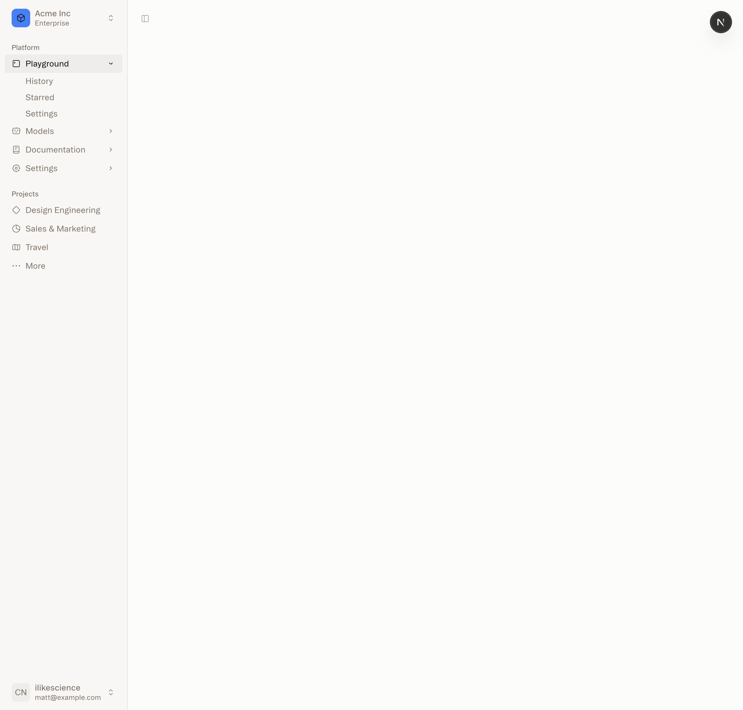
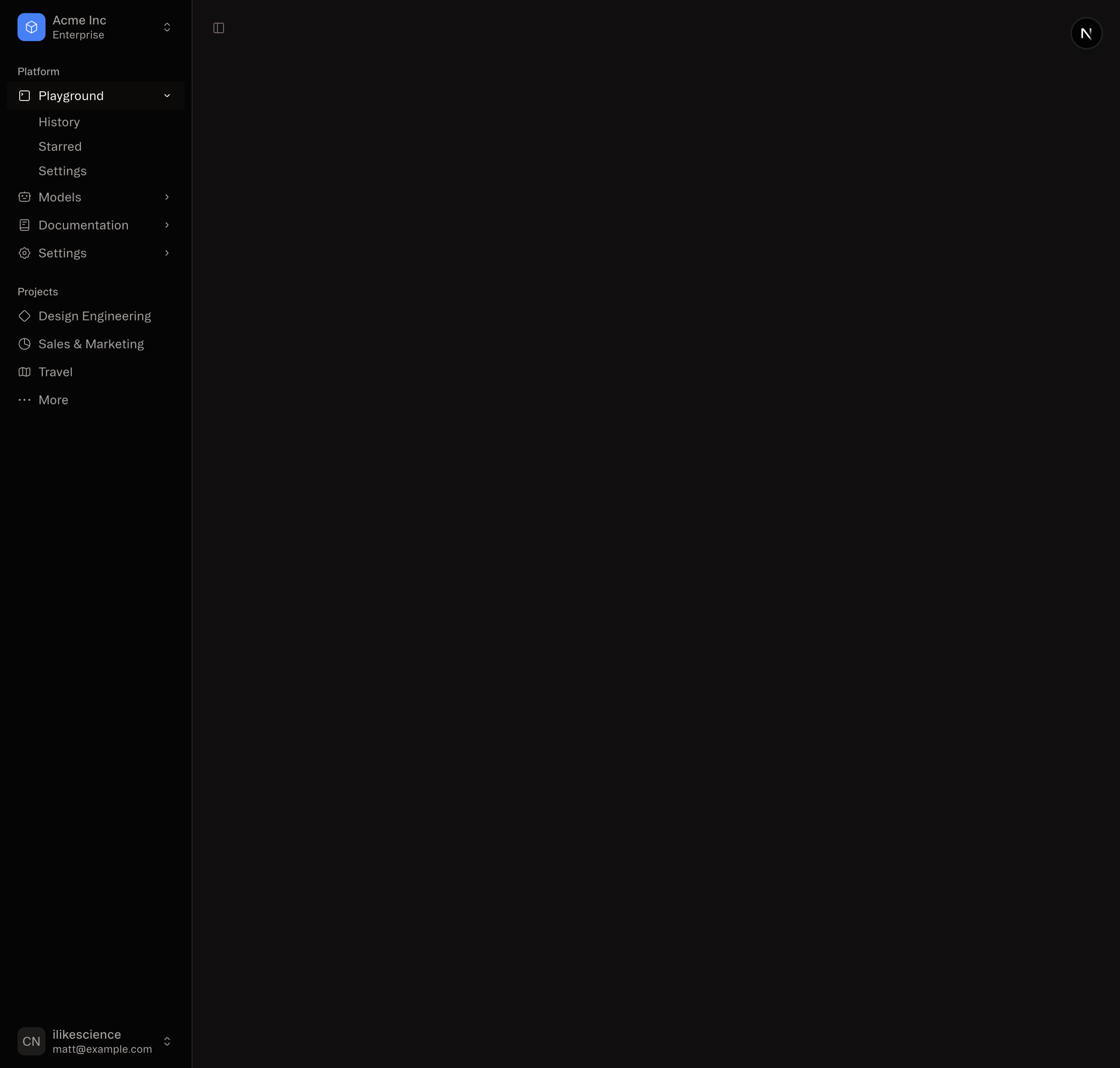
Structure
A Sidebar component is composed of the following parts:
<Sidebar.Provider />- Handles collapsible state.<Sidebar.Root />- The sidebar container.<Sidebar.Header />and<Sidebar.Footer />- Sticky at the top and bottom of the sidebar.<Sidebar.Content />- Scrollable content.<Sidebar.Group />- Section within the<Sidebar.Content />.<Sidebar.Trigger />- Trigger for theSidebar.
Usage
import { Sidebar } from "@smartacteam/ambient-web/sidebar";
import { AppSidebar } from "@/components/app-sidebar";
export default function Layout({ children }: { children: React.ReactNode }) {
return (
<Sidebar.Provider>
<AppSidebar />
<main>
<Sidebar.Trigger />
{children}
</main>
</Sidebar.Provider>
);
}import { Sidebar } from "@smartacteam/ambient-web/sidebar";
export function AppSidebar() {
return (
<Sidebar.Root>
<Sidebar.Header />
<Sidebar.Content>
<Sidebar.Group />
<Sidebar.Group />
</Sidebar.Content>
<Sidebar.Footer />
</Sidebar.Root>
);
}Sidebar.Provider
The <Sidebar.Provider /> component is used to provide the sidebar context to the Sidebar component. You should always wrap your application in a <Sidebar.Provider /> component.
useSidebar
The useSidebar hook is used to control the sidebar.
"use client";
import { useSidebar } from "@smartacteam/ambient-web/sidebar";
export function AppSidebar() {
const {
state,
open,
setOpen,
openMobile,
setOpenMobile,
isMobile,
toggleSidebar,
} = useSidebar();
}Sidebar.Root
The main <Sidebar.Root /> component used to render a collapsible sidebar.
Note: If you use the inset variant, remember to wrap your main content in a
<Sidebar.Inset />component.
Sidebar.Header
Use the <Sidebar.Header /> component to add a sticky header to the sidebar.
<Sidebar.Root>
<Sidebar.Header>
<Sidebar.Menu>
<Sidebar.MenuItem>
<Sidebar.MenuButton>
<span>Acme Inc</span>
</Sidebar.MenuButton>
</Sidebar.MenuItem>
</Sidebar.Menu>
</Sidebar.Header>
</Sidebar.Root>Sidebar.Footer
Use the <Sidebar.Footer /> component to add a sticky footer to the sidebar.
<Sidebar.Root>
<Sidebar.Footer>
<Sidebar.Menu>
<Sidebar.MenuItem>
<Sidebar.MenuButton>Username</Sidebar.MenuButton>
</Sidebar.MenuItem>
</Sidebar.Menu>
</Sidebar.Footer>
</Sidebar.Root>Sidebar.Content
The <Sidebar.Content /> component is used to wrap the content of the sidebar. This is where you add your <Sidebar.Group /> components. It is scrollable.
<Sidebar.Root>
<Sidebar.Content>
<Sidebar.Group />
<Sidebar.Group />
</Sidebar.Content>
</Sidebar.Root>Sidebar.Group
Use the <Sidebar.Group /> component to create a section within the sidebar.
A <Sidebar.Group /> has a <Sidebar.GroupLabel />, a <Sidebar.GroupContent /> and an optional <Sidebar.GroupAction />.
<Sidebar.Group>
<Sidebar.GroupLabel>Application</Sidebar.GroupLabel>
<Sidebar.GroupAction>
<span>Add Project</span>
</Sidebar.GroupAction>
<Sidebar.GroupContent>...</Sidebar.GroupContent>
</Sidebar.Group>To make a <Sidebar.Group /> collapsible, wrap it in a <Collapsible /> component.
<Collapsible.Root defaultOpen className="group/collapsible">
<Sidebar.Group>
<Sidebar.GroupLabel asChild>
<Collapsible.Trigger>Help</Collapsible.Trigger>
</Sidebar.GroupLabel>
<Collapsible.Panel>
<Sidebar.GroupContent />
</Collapsible.Panel>
</Sidebar.Group>
</Collapsible.Root>Sidebar.Menu
The <Sidebar.Menu /> component is used for building a menu within a <SidebarGroup />.
<Sidebar.Menu>
{projects.map((project) => (
<Sidebar.MenuItem key={project.name}>
<Sidebar.MenuButton
render={
<a href={project.url}>
<project.icon />
<span>{project.name}</span>
</a>
}
/>
</Sidebar.MenuItem>
))}
</Sidebar.Menu>Sidebar.MenuButton
The <Sidebar.MenuButton /> component is used to render a menu button within a <Sidebar.MenuItem />.
By default, the <Sidebar.MenuButton /> renders a button but you can use the render prop to render a different component such as a Link or an a tag.
Use the isActive prop to mark a menu item as active.
<SidebarMenuButton isActive render={<a href="#">Home</a>} />Sidebar.MenuAction
The <Sidebar.MenuAction /> component is used to render a menu action within a <Sidebar.MenuItem />.
<Sidebar.MenuItem>
<Sidebar.MenuButton
render={
<a href="#">
<Home />
<span>Home</span>
</a>
}
/>
<Sidebar.MenuAction>
<span>Add Project</span>
</Sidebar.MenuAction>
</Sidebar.MenuItem>Sidebar.MenuSub
The <Sidebar.MenuSub /> component is used to render a submenu within a <Sidebar.Menu />.
<Sidebar.MenuItem>
<Sidebar.MenuButton />
<Sidebar.MenuSub>
<Sidebar.MenuSubItem>
<Sidebar.MenuSubButton />
</Sidebar.MenuSubItem>
</Sidebar.MenuSub>
</Sidebar.MenuItem>Sidebar.MenuBadge
The <Sidebar.MenuBadge /> component is used to render a badge within a <Sidebar.MenuItem />.
<Sidebar.MenuItem>
<Sidebar.MenuButton />
<Sidebar.MenuBadge>24</Sidebar.MenuBadge>
</Sidebar.MenuItem>Sidebar.MenuSkeleton
<Sidebar.Menu>
{Array.from({ length: 5 }).map((_, index) => (
<Sidebar.MenuItem key={index}>
<Sidebar.MenuSkeleton />
</Sidebar.MenuItem>
))}
</Sidebar.Menu>Sidebar.Trigger
Use the <Sidebar.Trigger /> component to render a button that toggles the sidebar.
"use client";
import { useSidebar } from "@smartacteam/ambient-web/sidebar";
export function CustomTrigger() {
const { toggleSidebar } = useSidebar();
return <button onClick={toggleSidebar}>Toggle Sidebar</button>;
}Sidebar.Rail
The <Sidebar.Rail /> component is used to render a rail within a <Sidebar.Root />. This rail can be used to toggle the sidebar.
<Sidebar.Root>
<Sidebar.Header />
<Sidebar.Content>
<Sidebar.Group />
</Sidebar.Content>
<Sidebar.Footer />
<Sidebar.Rail />
</Sidebar.Root>Controlled Sidebar
Use the open and onOpenChange props to control the sidebar.
"use client";
export function AppSidebar() {
const [open, setOpen] = React.useState(false);
return (
<Sidebar.Provider open={open} onOpenChange={setOpen}>
<Sidebar.Root />
</Sidebar.Provider>
);
}Styling
Here are some tips for styling the sidebar based on different states.
<Sidebar.Root collapsible="icon">
<Sidebar.Content>
<Sidebar.Group className="group-data-[collapsible=icon]:hidden" />
</Sidebar.Content>
</Sidebar.Root><Sidebar.MenuItem>
<Sidebar.MenuButton />
<Sidebar.MenuAction className="peer-data-[active=true]/menu-button:opacity-100" />
</Sidebar.MenuItem>